App for new and expecting parents
Product Design Case Study

Koble is an app offering accessible family planning, pregnancy, postpartum, and return-to-work support. Includes expert-led courses and 1-on-1 coaching for expecting and new parents.
Problem
The current weekly engagement with Koble content (e.g. videos viewed, sessions booked) was sitting at 30%, which was not a strong enough number to validate if Koble’s value proposition was resonating with their members.
Original Interface
The original app offered stage based video sessions and 1-on-1 communication with experts. However, there was no curriculum layout for parents to navigate real-time curriculum learning.

Project
Objective
Introduce curriculum:
Increase Koble’s value proposition by implementing a new curriculum style feed with real-time, stage based learning tools to support parents navigating through pregnancy and postpartum stages.
Impact weekly engagement
Create emotional attachment & stickiness to the product to increase weekly engagement from 30% to 50% WAU.
Key features to create
Insights for you
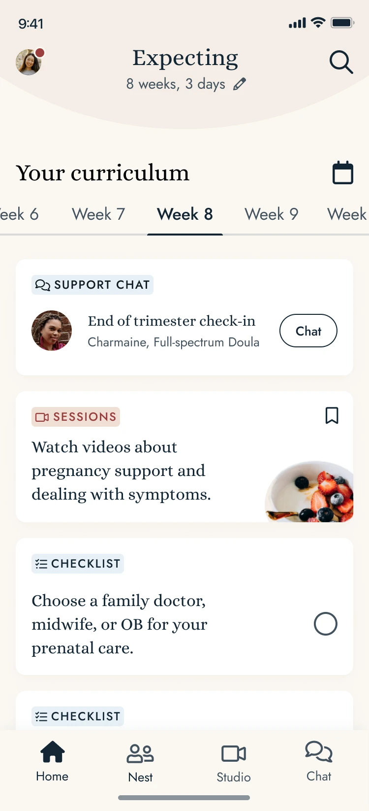
A curriculum timeline with stage-based pregnancy and postpartum resources
Stage-based curriculum
Week by week content related to the current trimester and week
Current stage
Real time indication of the pregnancy stage to provide appropriate guidance for current stage
Project Team
Swatti Matta
Founder & CEO
Muriel Haldenby
Head of Product Design
Abimbola Olayinka
Junior Product Designer
Raveti Shroti
Clinical Operations Specialist
Dr. Yolanda Kirkham OBGYN
Chief Medical Officer
Scope & Responsibilities
In this project, I was responsible for conducting market research, conducting surveys, designing user flows, wireframing and prototyping, and testing the new curriculum based approach to the Koble application.
I worked under the supervision of Muriel Haldenby, the Senior Product Designer who not only planned and coordinated the new direction of the application, but mentored the Junior Designers throughout the process. Timeline : 4 week duration
Design Process
Empathized
Empathize with users to deeply understand their needs and pain points.
Conducted video interviews with Koble members for deeper insight
Researched
Researched and studied comparable curriculum based products in the market
Presented visual summaries, analysis’, and presented potential solutions for the research findings
Created user flows
Identified MVP’s
Information architecture
Depicted the step-by-step paths that the user takes while navigating the curriculum application and presented them to the Koble team
Prototyped
Information architecture
Low fidelity wireframes
Tested with Userbrain
Curriculum concept testing
Prototype usability testing
High fidelity wireframing
Created high fidelity wireframes of the Koble curriculum application
Handoff to development team
UX Research
I empathized, conducted market research, designed prototypes & carried out interviews & usability testing.
Market Research
Empathize with users to deeply understand their needs and pain points.
1-1 Interviews
Conducted video interviews with 5-7 Koble members for deeper insight on their experience with the Koble application
Included curriculum concept testing to gain insight from our members
Research Analysis
Presented visual summaries, analysis’, and presented potential solutions for the research findings
Usability Testing with Userbrain
I conducted usability testing to assess the app's navigation effectiveness and gather user feedback on its clarity
Competitor Analysis
I conducted in-depth research on product competitors within the industry, analyzing their strengths and weaknesses.
This research helped the team identify opportunities for improvement and served as a foundation for crafting a unique and user-centric product that addressed user needs more effectively

Expert-led classes from pregnancy through parenthood
(+) Community page to connect with experts and other parents
(+) App asks members to add their zipcode to connect with parents like them and join communities
(-) Finicky app, lags

A weight loss program that helps you change your habits and mindset around food
(+) Implements quizzes in their curriculum
(+) Display weekly takeaways and tips and upcoming sessions
(+) Personal coaching

Pregnancy and birth education
(+) In a network with major insurance plans
(+) Convenient bookmark feature
(-) Learn sections can be text heavy

Virtual mom and baby wellness support
(+) Course shows entire curriculum on one page separated by chapters
(+) Great framework for the course weekly content

All - In - One Women's Health App
(+) Use story format to show tips
(+) Convenient bookmark feature
(-) Learn sections can be text heavy
User Flows
This involved a deep understanding of user needs and goals, careful consideration of content organization, and ensuring a seamless and intuitive navigation experience.

Low Fidelity Prototypes

Userbrain Lo-Fi Usability Tests
Key Takeaways

I wrote out task instructions to guide the testers through the high fidelity prototype and we tested on the Userbrain platform. The testers were recorded and instructed to speak their thoughts aloud. Each tester's journey through the app was reviewed and the information was synthesized to provide actionable insights.
Testing Task Instructions

Feedback
First Impression
(+) Off the bat, testers knew that the app provides support, information and guidance for those who are currently pregnant.
User Segment
Age range from 28-50
Current Koble members
70 % Female, 30% Male
70 % US citizens, 30% Canadian
70% expecting a child, 30% have newborns
Opinions on information delivery
(+) Easily digestable
(+) Familiar
What do you like most about the homepage?
(+) Testers seem to like the simplicity, neat organization, easy navigation, colour scheme, information offered in insights for you, search bar, and checklist
(+) Insights for you is a valuable resource that they would come back to regularly
What do you like least about the homepage?
80% did not have anything they do not like
"Make the profile icon bigger, “looks a bit difficult to press”
How far in advance should we show curriculum content?
1 month in advance - 4 weeks of information
2 - 3 weeks ahead
“If it's too much content, I'm probably not going to ever take advantage of it”
“Week by week till im due”
"Should be customizable … until the trimester period is over"
Everything - From first week of pregnancy to end at once
“And I want to know what to expect before I started, like before it starts happening to me.”
High Fidelity Prototype & Final Screens
Outcome
Successfully designed the user interface for a seamless user flow
Prioritized user-centric approach to enhance the user experience
Resuted in an updated framework to launch for the application

Components and Style Guide
Final Screens