Supporting Parenthood: A Curriculum for New and Expecting Parents


Project Background

Koble is a digital health and wellbeing platform offering accessible family planning, pregnancy, postpartum, and return-to-work support. It Includes expert-led video courses and 1-on-1 coaching for expecting and new parents.
Original Interface
The original app provided valuable stage-based video sessions, articles, and 1-on-1 communication with experts, offering personalized support to parents.
Despite offering useful parenting resources, the app lacked a structured curriculum to guide parents through real-time, stage-specific learning.

Low engagement and retention 📉
Despite offering valuable parenting resources, the app lacked a structured curriculum to guide parents through real-time, stage-specific learning. As a result, engagement remained low, with weekly active users engaging at just 30%.
Increase weekly engagement and retention 📈
Koble aimed to create emotional attachment & stickiness to the product to increase weekly engagement from 30% to 50% WAU.
Introduce curriculum feature to enhance Koble's value proposition 📓
Koble wanted to introduce an intuitive, stage-based curriculum that would make Koble an indispensable resource for parents.
Founder & CEO
Head of Product Design
Junior Product Designer
Clinical Operations Specialist
Chief Medical Officer
My Role & Responsibilities
As a Junior Product Designer, I played a key role in shaping the curriculum-based approach for Koble’s platform. My responsibilities spanned all stages of the design process, including:
Conducting market research, user surveys, and in-depth interviews to gather insights.
Designing user flows, wireframes, and interactive prototypes to test and refine ideas.
Collaborating with stakeholders to align design decisions with user needs and business goals.
Leading usability testing to validate the effectiveness of the new curriculum feature.
Research & Competitive Analysis
Competitive Analysis
I conducted market research on similar curriculum-based products, analyzing platforms like Tinyhood, Noom, Oula, Expectful, and Flo. My focus was on identifying strengths, areas for improvement, and actionable insights:

Expert-led classes from pregnancy through parenthood
Strong emphasis on community engagement through localized connections and expert support fosters meaningful interactions.

Weight loss program
Engaging quizzes, personal coaching, and clear weekly insights create an effective and motivating program structure.

Pregnancy and birth education
Accessible through major insurance networks and featuring a convenient bookmark tool.
Enhancing content presentation could improve learning engagement.

Virtual mom and baby wellness support
A well-structured curriculum with clear chapters offers seamless navigation for users, supporting a smooth learning journey.

All - In - One Women's Health App
Story-driven tips and bookmarking features provide a user-friendly experience.
Incorporating familiar visual elements could elevate content accessibility.
Key Takeaways
Incorporate features to build meaningful user networks.
Provide coaching and deliver engaging weekly insights to keep users motivated.
Organize content with clear, stage-based frameworks for ease of use.
Use familiar story-driven formats and bookmarking tools to create a more interactive experience.
Understanding User Needs

Our Goal
Our goal through testing was to assess the app's navigation effectiveness and gather user feedback on its clarity. We wanted to know:
If the current layout for the screens are user friendly and easily understood.
If users see value in the curriculum and the offerings of the curriculum (what to expect (symptoms), checklist, etc).
If the placement and order of the curriculum information is easily navigable.

Overview of Prototype Screens
User Segment: Who are we testing with?
Age Range: 28 to 50 years old
Gender: 70% female, 30% male
Location: 70% US-based, 30% Canadian
Parenting Stage: 70% expecting a child, 30% have newborns
What artifacts and tools will we use?
We used Figma to create wireframes and prototypes of the curriculum homepages, and the Userbrain testing platform to test the prototype.
Empathy-Driven Research
What steps did we take?
The testing process involved multiple tasks designed to evaluate key features of the prototype, focusing on engagement, information clarity, and navigation ease.
📍
I wrote out task instructions to guide the testers through the high fidelity prototype and we tested on the Userbrain platform.
📍
The testers were recorded and instructed to speak their thoughts aloud.
📍
Each tester's journey through the app was reviewed and the information was synthesized to provide actionable insights.
Below is a summary of the task instructions and the insights gathered:

Here is a detailed example of one of our task instructions:

Some direct quotes from our testers 💬
Upon reviewing all of the the feedback this is what we learned…
Key Takeaways
Clear Purpose:
Participants easily understood that the app provides support and guidance for pregnancy.
App Usability:
The content was easy to digest, familiar, and well-organized, with testers appreciating features like "Insights for you" and the checklist.
Curriculum Timing Preferences:
Participants preferred content to be shown 1 month ahead, 2–3 weeks ahead, or week-by-week until the due date.
Proactive Information:
Users wanted to know what to expect ahead of time, even before experiencing specific pregnancy stages.
From Feedback to Features
User research played a pivotal role in shaping Koble's redesign. Here’s how we turned feedback into actionable design decisions.
Design Decisions
Clear Purpose
Emphasized the app’s core value of providing support, guidance, and information for pregnancy in the UI.
Prioritized familiarity and usability
Focused on creating easy-to-digest content, using familiar layouts, simple navigation, and adding key features to keep users engaged.
Curriculum Preferences
Introduced flexible curriculum timing options, allowing users to view content 1 month ahead, 2-3 weeks ahead, or on a week-by-week basis.
Proactive Information
Added proactive content that anticipates users’ needs by showing what’s coming next in their pregnancy journey.

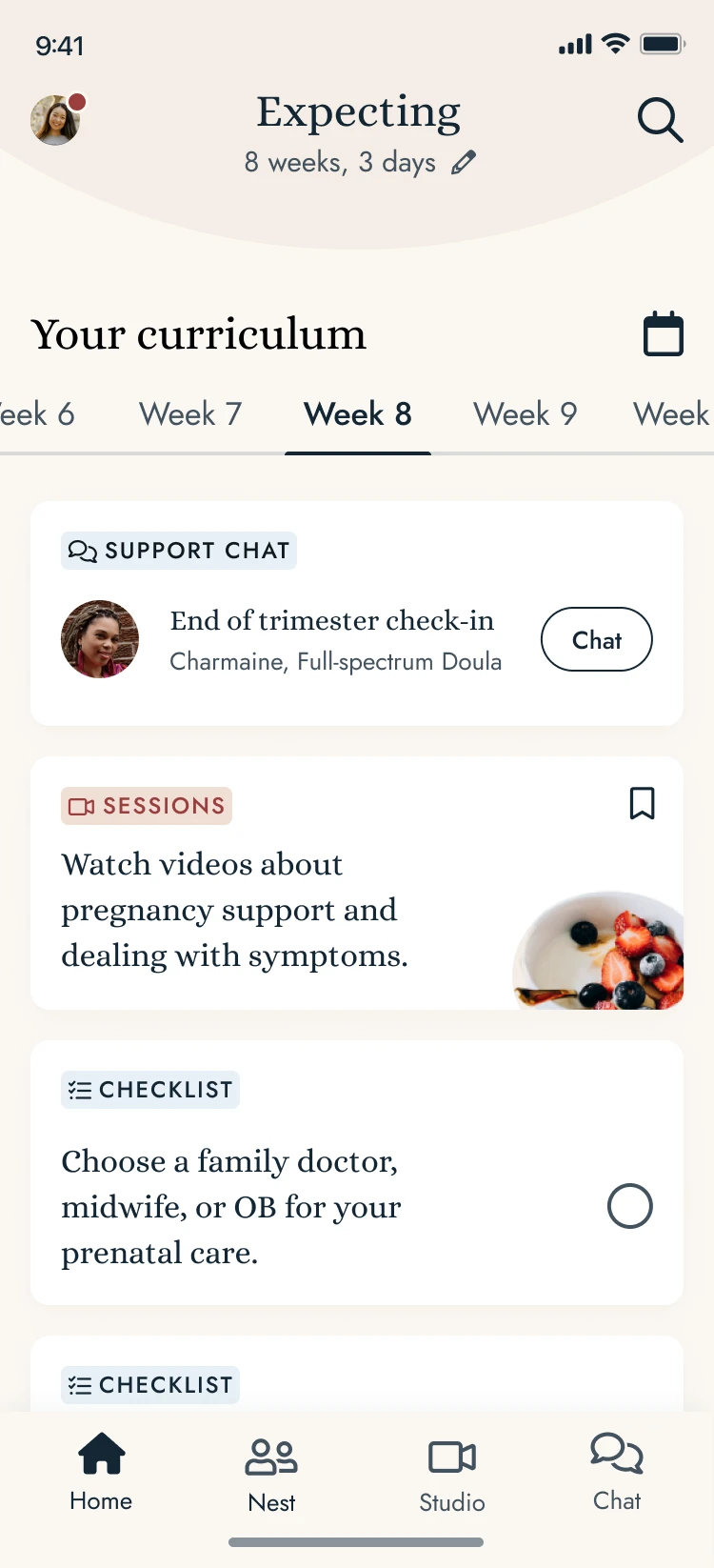
Feature 1
'Insights For You'
Personalized, stage-based updates to keep users informed and engaged. Once pressed, expand into story style content.

Feature 3
'Insights for You Story Pages'
Created a familiar and digestable format of information for parents to learn about things to expect.

Feature 2
'Checklist'
Helps users stay on track with actionable tasks and recommendations.

Feature 4
'Flexible Stage Selection'
Allowing users to view content 1 month ahead, 2-3 weeks ahead, or on a week-by-week basis.
Final Screens
I successfully designed the user interface for a seamless user flow and prioritized a user-centric approach to enhance the user experience that resuted in an updated framework to launch for the application


The Design System
Throughout the design process, I updated and refined the design systems to ensure consistency, accessibility, and scalability. These systems included typography, color palettes, components, and layouts, forming the foundation for a cohesive user experience.


Project Takeaway + What I learned
Empathy as a Design Superpower 💡
This experience reinforced that empathy in design extends beyond problem-solving—it’s about truly understanding and anticipating users’ emotions, needs, and challenges. Observing how parents engaged with the curriculum feature highlighted the profound impact of designing with care, intention, and a human-first approach. It deepened my ability to see design as a tool for reassurance and empowerment, shaping experiences that feel both intuitive and emotionally supportive.
Balancing Consistency and Creativity🚀
As an entry-level designer, I initially hesitated to challenge existing ideas. Over time, I grew more confident in advocating for user needs, leading discussions, and iterating on feedback to refine the experience.
Information Hierarchy is Key🔑
This project reinforced how crucial information hierarchy is. Organizing content effectively isn’t just about aesthetics—it directly impacts usability and how intuitive a product feels. This experience sharpened my ability to structure information in a way that makes interactions smoother and more user-friendly.
Conclusion
I was not around for the launch of this product, but I was aware through user testing that this approach for the company would increase the value proposition of the app. Through user research, iterative testing, and thoughtful design, I contributed to a more engaging, structured learning experience for new and expecting parents. This project was an invaluable opportunity to grow as a designer, balancing usability with emotional connection to support users through one of life’s biggest transitions.