Good UX Even at Goodbye:
Designing a Guilt Free Account Deletion Process


Project Background

Koble is a digital health and wellbeing platform offering accessible family planning, pregnancy, postpartum, and return-to-work support. It Includes expert-led video courses and 1-on-1 coaching for expecting and new parents.
What was the problem at hand?
Koble users did not have a way to delete their accounts.
To comply with Apple’s newly instated App Store Review Guideline 5.1.1, the company needed to implement this feature.
Beyond compliance, this was about giving users the freedom to leave on their own terms if Koble no longer met their needs.
Project Objective
Enable users to easily delete their accounts within their profile.
Design an easy and ethical account deletion process that gives users full control over their data, with no guilt or confusion.
Project Team
Swatti Matta
Founder & CEO
Muriel Haldenby
Head of Product Design
Abimbola Olayinka
Junior Product Designer
My Role and Responsibilities
As a Junior Product Designer, I played a key role in designing the account deletion feature for Koble. My responsibilities included:
Conducting market research on industry trends and user expectations for account deletion.
Designing user flows, wireframes, and prototypes for a seamless experience.
Collaborating with stakeholders to align the feature with user needs and App Store guidelines.
Analyzing and updating product usage analytics on a weeekly basis.
Feature Research
Researching Comparable Applications
Before designing the user flows, I analyzed how similar apps handle account deletion. This research helped identify best practices, common pain points, and areas for improvement.
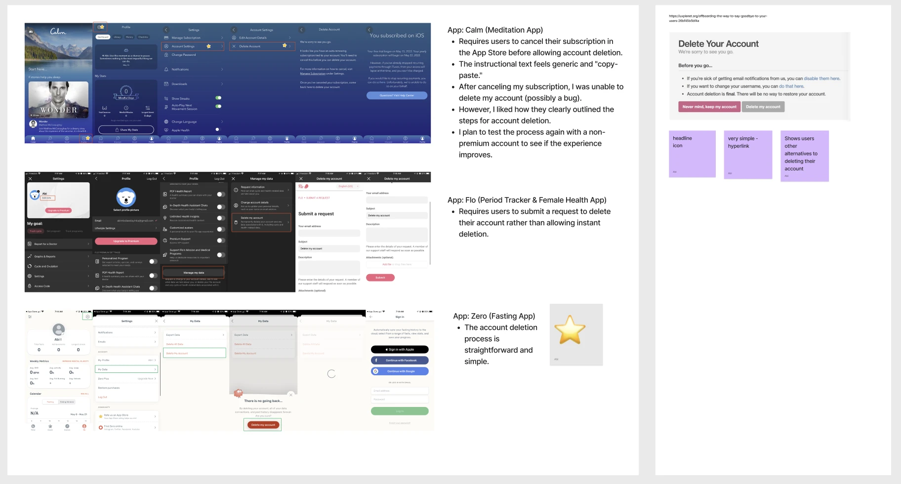
A glimpse at my whiteboard comparing account deletion flows
Key Takeaways
Some common themes I found in ethical account deletion processes include transparency, user control, and clear communication about the consequences of account deletion. Therefore, I made sure to incorporate the following elements into my screens:
Confirmation Prompt: Add a confirmation step to prevent accidental clicks.
Clear Consequences: Ensure users understand the permanent loss of their data.
Billing & Cancellation Notice: Clearly explain what happens to billing when users cancel their subscription.
User Feedback: Collect reasons for account deletion to gather insights and improve the experience.
Error State: Keep users informed of any errors during the deletion process.
Planning out the Screens
User Flow
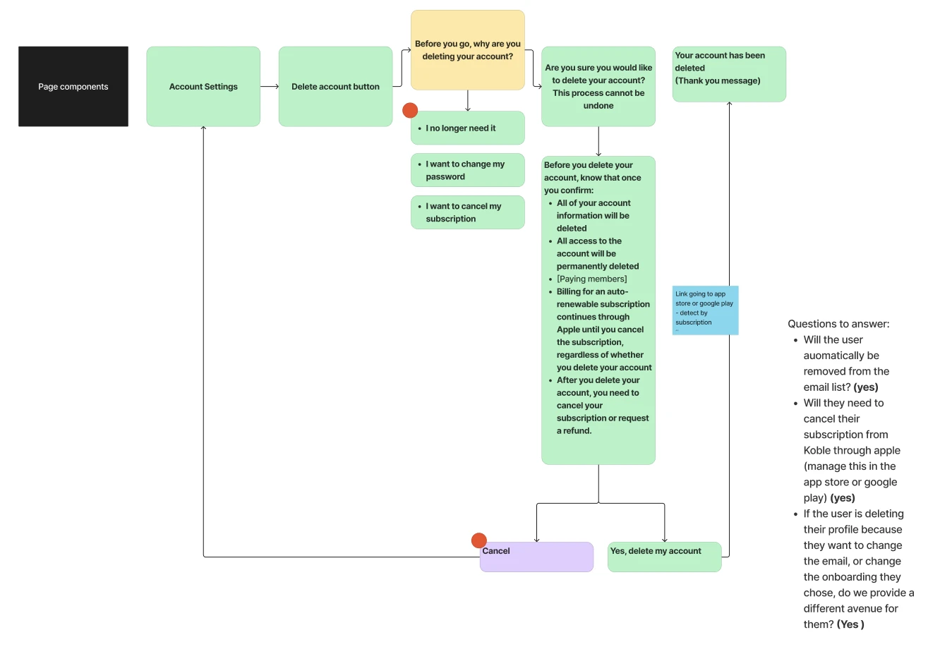
After conducting research, I designed user flows to map out the account deletion process, making sure each step was clear and smooth for users.
Overview of account deletion user flow

Low Fidelity Wireframes
This involved a deep understanding of user needs and goals, careful consideration of content organization, and ensuring a seamless and intuitive navigation experience.
Overview of account deletion wireflow 1
Overview of account deletion wireframe 2

Overview of high fidelity wireframes

Key Pages ⭐️

'Confirmation + Billing & Cancellation'
Ensure users understand the permanent loss of their data and are sure in their decision to follow through with the process.
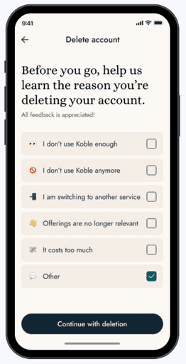
'Survey Page 1'
Collect reasons for account deletion to gather insights and improve the experience.

'Survey Page 2'
If user selects 'other' prompt them to explain their reason.

page 3
'Error State'
Final Screens


Conclusion
Final Thoughts
I really enjoyed working on a project that focused on designing a sensitive feature like account deletion in a way that was thoughtful and user-centric. It gave me the chance to practice clear communication and craft a flow that was transparent, guilt-free, and respectful of the user’s choice.
Key Takeaways:
It reinforced how crucial it is to keep sensitive processes simple and transparent.
Clear communication helps users feel in control and confident in their decisions.
Thoughtful design can reduce frustration and make even tough choices feel less stressful.